Assignment 1.5.1
The best ways to approach the practical component of this activity is to complete the activity using a digital photo and using graphic design software such as Adobe Photoshop. Your original artwork must present the same subject using the following requirements:
- three rows of the same image across; and three columns of images down;
- three images created by using the complementing colour schemes;
- one image by using a warm colour scheme;
- one image by using a cool colour scheme;
- four images using a colour scheme of your choice.
Submit your completed assignment to your ePortfolio and your original Photoshop .PSD file to the class Dropbox for your teacher.
TUTORIAL | STEP-BY-STEP INSTRUCTIONS TO CREATE YOUR IMAGE
HOW TO: POP ART – A MANUAL APPLICATION OF COLOUR THEORY
The American artist Andy Warhol was part of the Pop Art movement which shook up the art world in the 1960s. His iconic images of everything from Marilyn Monroe to Campbell’s Soup cans are easily recognisable even to this day.
In this tutorial I will show you how to use the various tools in Adobe Photoshop to create an Andy Warhol-style portrait effect in a handful of simple steps.
For this project we will recreate one of the styles popularised by Warhol. We’ll start by setting up the initial image by using one of the images you took of your partner or one that your partner took of you. We’ll then add a series of layers to the image and integrating colour theory that we have covered in Activity 5.
After taking a photograph of your subject, follow these steps:
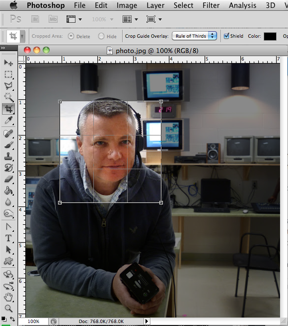
01 OPEN YOUR IMAGE
- Open your portrait image.
- Crop it to a square shape using the Crop tool (C).
- At this point you might want to make some adjustments to Brightness and Contrast of your image. Choose Image>Adjustments>Brightness/Contrast.
- Choose Window>Layers if the Layers Panel is not visible.
- Right-click the Background layer and choose Duplicate Layer. Click OK.
- Rename your new layer Photo
- Create a new layer (Layer>New>Layer).
- Make this new layer white (Edit>Fill: Contents>Use>White)
- Drag the new white layer below the “Photo” layer and rename it “background”.
- You can delete the original layer called “Background”.
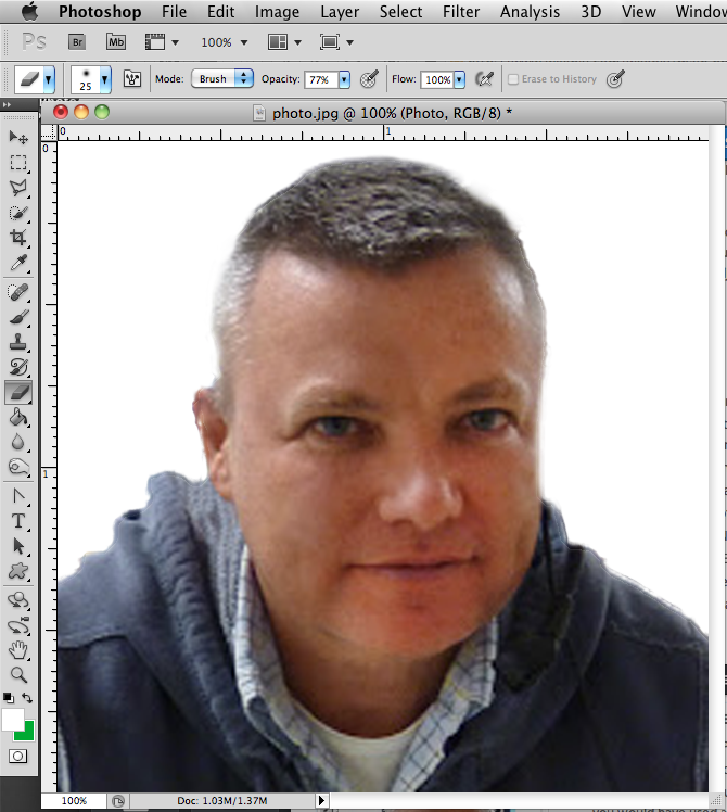
02 PREPPING YOUR IMAGE
- Now working on the “Photo” layer we need to clear out all the unwanted parts of the photograph.
- In this case I want to isolate me and delete the rest i.e the background walls, etc.
- To cut out the background I used the Quick Selction Tool. Most of you shouldn't need to do this since you would have used a plain neutral background. If you have a black background you may want to remove it and so you can see the white background layer you created.

03 MAKING IT BLACK AND WHITE
- Desaturate the photo (Ctrl+Shft+U).
- Adjust the Brightness/Contrast if needed. Image>Adjustments>Brightness/Contrast.
- Obviously the settings will be different for your photograph. Just adjust the sliders until your photo becomes quite dramatic.

04 THE CUTOUT FILTER
- Apply the Cutout Filter to the “photo” layer with the settings approximately as shown below.
- Filter>Artistic>Cutout…
- I had my setting set to No. of Levels 4,Edge Simplicity 2, Edge Fidelity 2.
- Adjust the Levels (Ctrl + L). You want to adjust the sliders until your photo is black, roughly 3 shades of grey, and white.
- Your settings will be different for yours. You will need to experiment and might need to start over to get it to the best settings for the look you are wanting.

05 GETTING IT RIGHT
- You will ultimately want your image to be black, grey, and white.
- You might need to lighten or darken areas of your image before it will look good.
- I had to darken my hair above my right ear or it looked like part of my head was missing.
- Don’t forget to Save as you work!
- Now let’s organise the canvas and create an Andy Warhol inspired layout.

06 PREPARING THE CANVAS
- Open up a new canvas (Ctrl +N) with the settings shown in the image or below.
- The size is 8 x 10. We use 300 dpi for the best quality print .
- Plus make sure the mode is set to CMYK. Click OK.

- Now go back to your original canvas. Click on your “photo” layer and drag and drop it onto you new “Warhol” canvas.
- Put the “photo” layer into a set. To create a new set, simply click the folder icon at the bottom of the layers window.
- Place the layer into a set by click dragging them onto the set. Rename the set appropiately e.g “frame 1″.
- Create a new layer and rename e.g “bg1″. Make sure it is in the “frame 1″ set and below the “photo” layer.
- Your layers window should now look like the image shown to the left.

- Working on the “bg1″ layer take the Rectangle Tool …not to be confused with the marquee tool…this tool is grouped with the custom shape tool.
- Shft + U and drag a rectangle to the size of the “photo” layer. Make sure the mode is set to Shape Layers before you draw the rectangle!!!!
- See image left.

- Make sure your Rulers are on (Ctrl + R), and drag two guides to divide up the canvas into 9 sections.
- Take your time and get it exact.
- See image.
*TIP: Make sure SNAP TO GUIDES is on and use the rectangular marquee with the INFO WINDOW to measure distances.

- Right click on the “frame 1″ set and select Duplicate Layer Set…. Do this 2 more times so you have a total of 9 sets.
- Rename all your sets to “frame 2″, “frame 3″, “frame 4″, etc.
- Now move all the sets into the right positions. If you hold down Shft as you drag the sets, it contrains the movement to only vertical or horizontal…very handy!
- Remember Save as you Go...

07 ADDING THE COLOUR
- one image by using a warm colour scheme;
- one image by using a cool colour scheme;
- four images using a colour scheme of your choice.
- Change the “bg1″ color for each set by double clicking on the Layer Thumbnail as shown.
- Select a colour from the Color Picker window that pops up and then click OK.
- Remember the following requirements and use the colour wheels from Activity 5 as a reference:
- one image by using a warm colour scheme;
- one image by using a cool colour scheme;
- four images using a colour scheme of your choice.

- Not sure what color to use for a colour scheme of your choice?
- Use the Andy Warhol picture on the left as a guide. However, note that he uses three colours and we are working with only two.

08 ADD COLOUR TO SUBJECT
METHOD 1
METHOD 1
- Create a new layer in the “frame 1″ set and rename it “pc”. (That stands for person color, not very imaginative).
- Place this layer between the two existing layers. See picture.
- Click on your “photo” layer in your layer palette then
Select >> Load Selection

- Look at the canvas and you will find the “photo” subject/s perfectly selected.
- Now still working on the “pc” layer, grab the paint bucket tool and fill the selection with you a vibrant color.

- Now click on the “photo” layer and change the mode to either Linear Burn or Screen on the pull down menu.
- Depending on what looks better try the different modes.
- See image.
- You can also try changing the Hue or Saturation. Image>Adjustments>Hue/Saturation…
- Remember Save as you Go...

- Once you get your single image to the correct setting you want you can apply the steps to the other frames to complete your work.
- Save your Photoshop file as Warhol.LASTNAME.FIRSTNAME.psd
- Submit your Photoshop file to the shared class folder's Dropbox.

|

|
 Red+Green+Blue=White Red+Green+Blue=WhiteRed+Green=Yellow Red+Blue=Magenta Blue+Green=Cyan RGB Colour Model - RED-GREEN-BLUE This is an additive colour model, meaning that the colours are produced by transmitted light. When is it used? RGB is used for monitors, projectors, and televisions as it uses transmitted light to display colours. You would use the RGB colour model if you were producing digital images for the Internet. In this colour model, Red, Green, and Blue combine to create White. |
 Cyan+Magenta+Yellow=Black Cyan+Magenta+Yellow=Black Cyan+Magenta=Blue Cyan+Yellow=Green Yellow+Magenta=Red CMYK Colour Model
CYAN-MAGENTA-YELLOW-BLACK This is a subtractive colour model, meaning colors are produced by reflected light. When is it used? CMYK, sometimes known as process colour, is ideal for printed materials such as posters, brochures, and photographs as it uses ink to produce the color. Printers will contain ink cartridges for each of the colours. Cyan, Magenta, and Yellow inks combine to produce black. CMYK is also important to know for the colour correction of photos. |
